|
Recently started posting on instagram focused on two thing, fonts and their possible abstract uses, with just my sudo name.
0 Comments
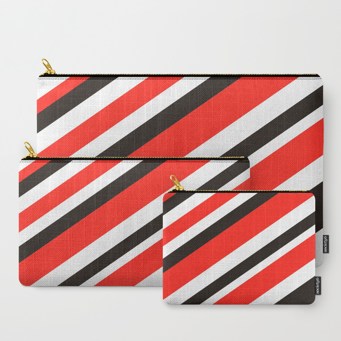
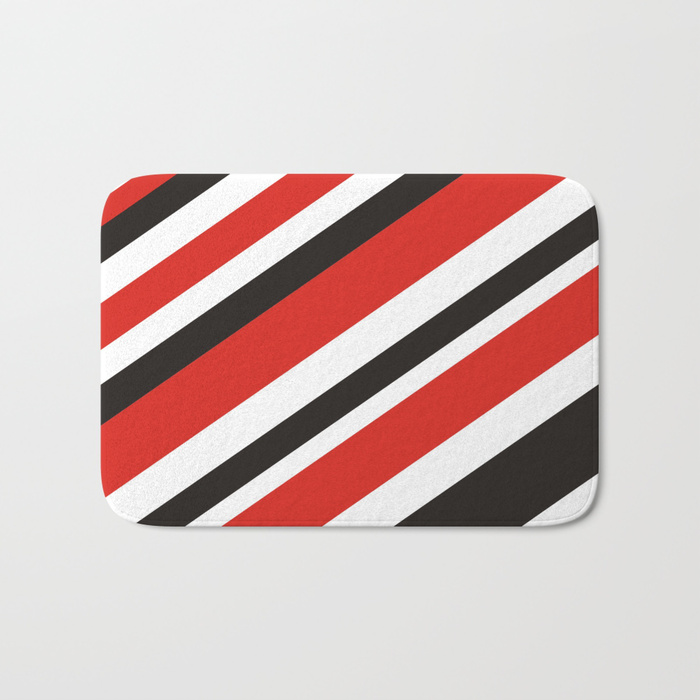
 Designing always requires grids and layouts for neatness and clarity. Yet there are designs that may make you think otherwise. New trends defy the boundaries and sticking to layouts and grinds isn’t their thumb rule, as they just want to have fun. Which in turn makes this interesting and much more open to newness. But still, usually if you are using 90-100% layouts and grids, go out of your comfort zone and use abstract art for designing, and bring in only 5-10% of an element to be in grid, that’s where neatness strikes.    Note closely, the abstract quotes in the design below, may look like they are not following any layout, yet there is a grid that is holding them together, with colors used to focus in a hierarchy. Will update this post with more examples.  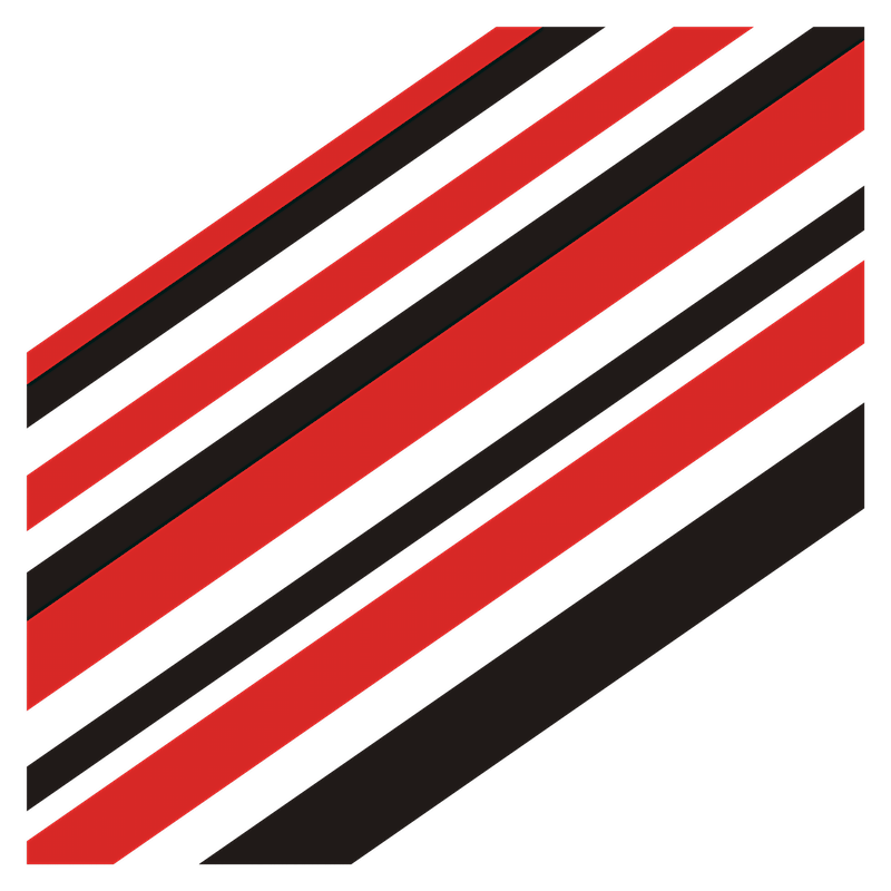 When there are riots and rallies and so much more going around the world, somewhere someone on this planet is not really bothered or perhaps giving more attention to colors, lines and design balance. So, here I am, sharing my well balanced artwork using red and black OVER white. I am sure many can get the concept behind it. But in case you don't, you can always ask me. I'll give you that divine knowledge of the reality that it is. In more simpler words, Red and Black is rad! (RnBiR) The red and black bold lines are made to portray the only thing, that they stand out regardless of how much white space there is. Worry was to make sure they are balanced and gives a sense of speed and power. 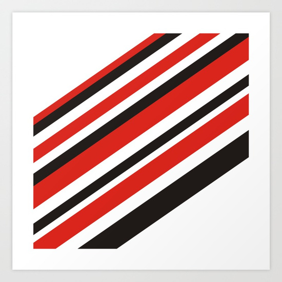 The wonderful thing to see is the flow of the lines. Even when the curtains are collapsed they seem to be going upwards. (well you may as well say downwards) and they look like stairs with those RnBiR curtain curls. 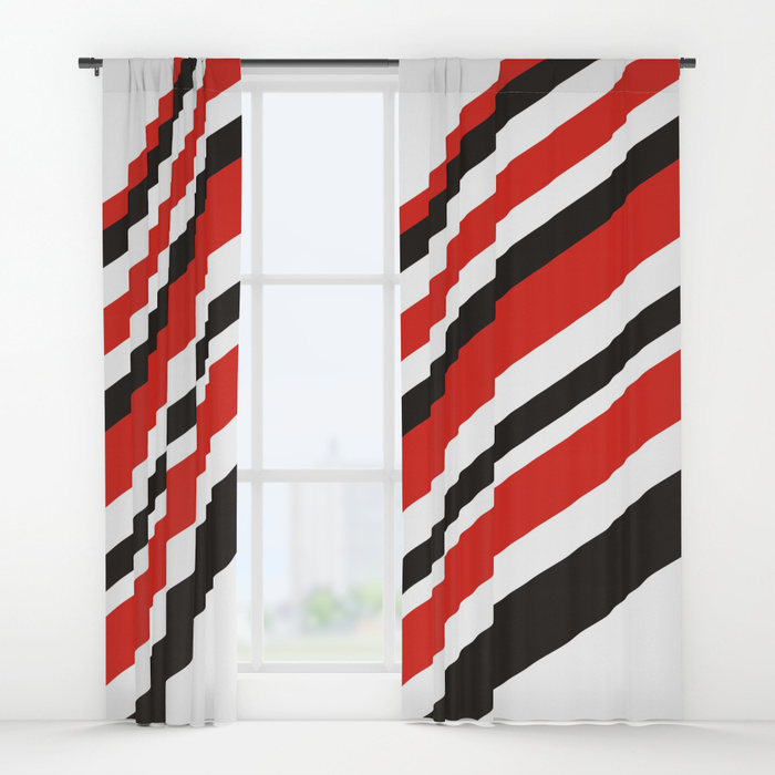 Let me know if you want to have a different set of colors in the same, I'll work on their balance. If it was not red but green, it wouldn't look as balanced as this, black lines would have to move accordingly. Just see how it looks on a red n black is rad rectangular pillow case. As if it's a soft candy ready to put your head to rest. 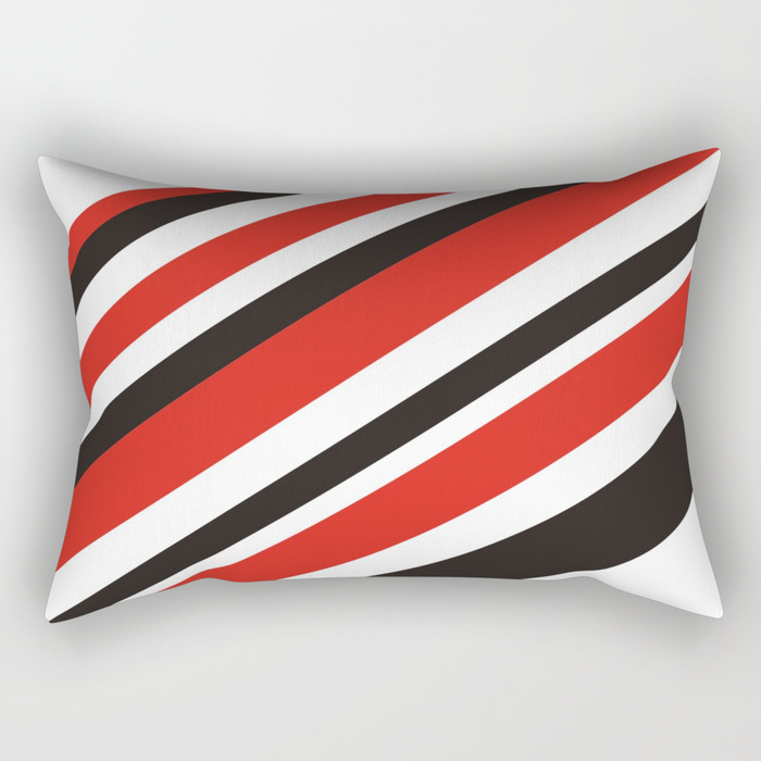 To a lay man's eye, these may seem like random lines with different weightage, but in reality there's lot of back and forth and thought process of design behind each line and why it is red or black, giving enough white space to breath. For example, this Red n Black is Rad Notebook, it's simply perfect, there's enough space for you to write your name and other things along with red and black lines. 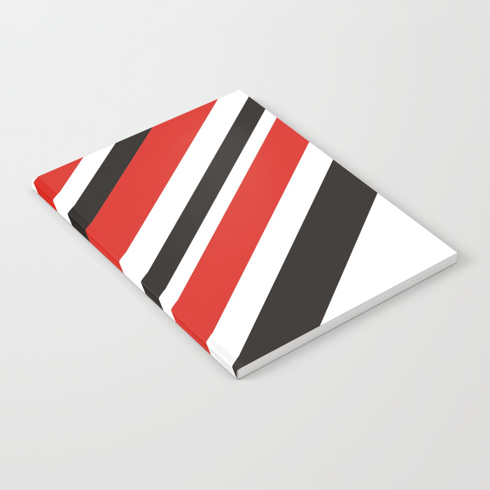 RnBiR is there on many other merchandise on Society6 like pouches, carry bags, mobile phone covers, throw pillow, shower curtains, bath mats, and much more.
There are many other designs I had made before on my Society6 profile. Do check them out or buy if you like them and let me know what you think of my designs.
'10' don'ts for Real designers Not to copy other's creative work, under no circumstances. 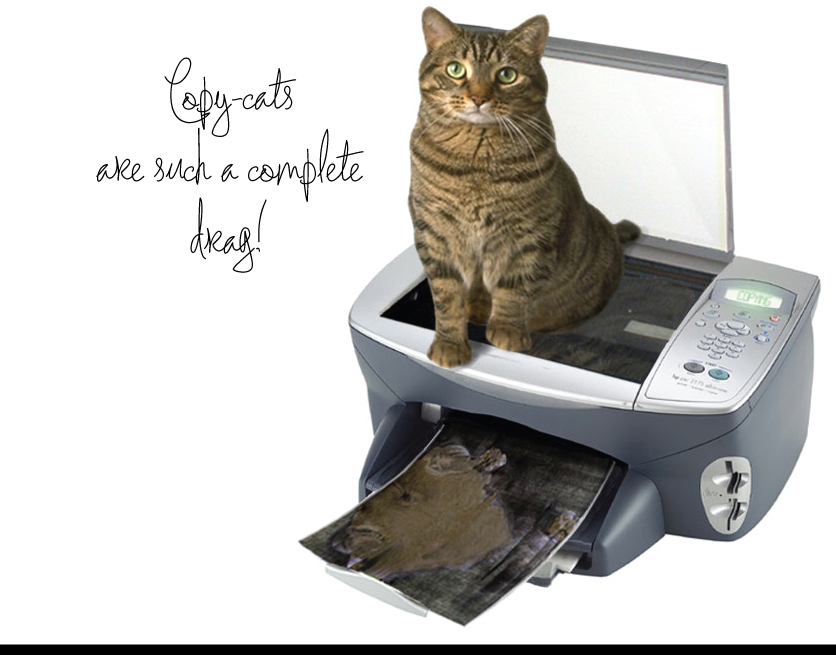 Not to rely completely on computer technology, it is a tool only and cannot substitute you creativity. Remember, you are a designer, not a computer graphic editor.  Be a creator and not a fashion-follower because a trendy style today would become an out-dated one tomorrow.  Trying ten design fields simultaneously but badly is worse than concentrating on one field and master it. 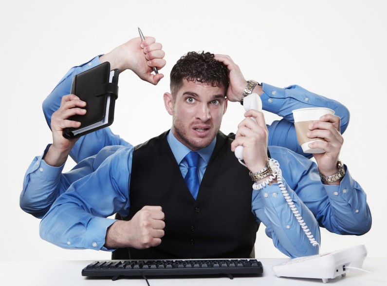 Be professional and don't release any artworks that you don't like. 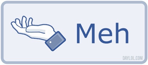 To not lower the quality in view of low business value of an artwork.  To not criticise other's artwork merely on the ground of one's preferences nor just replicate comment from someone.  To not create artwork without any ground. Great works usually come from the understanding of the culture, history and philosophy.  Keep yourself modest to people, whether you're a novice or a master. 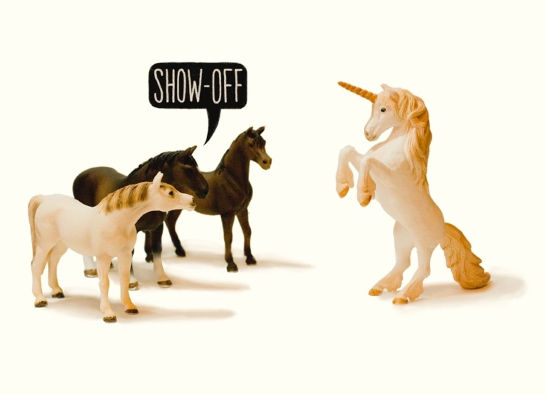 Always believe that design can save your country and change the world.  and so that concludes if you are a 'real' designer or not.
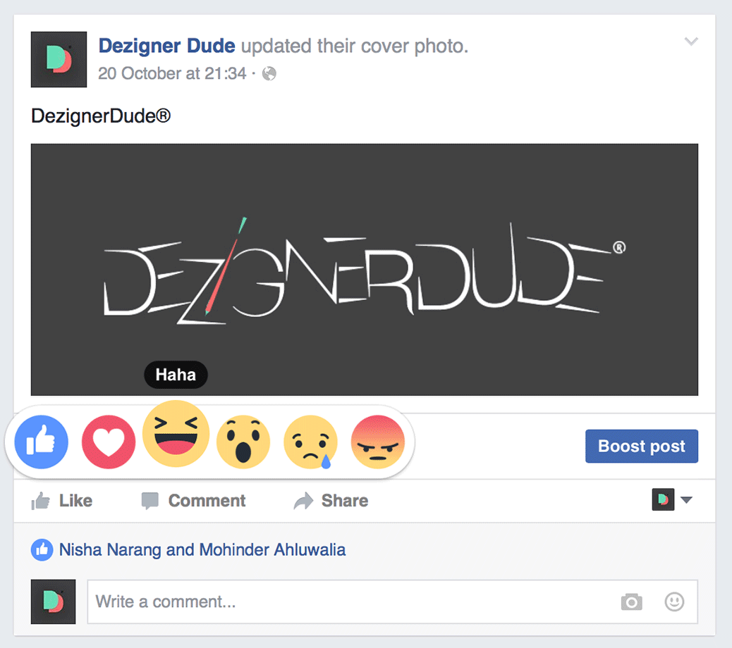 You all are very well aware of the reactions used on Facebook along with ever-famous 'like' feature. Since early this year Facebook launched their re-designed 'like' feature to let their users engage with more feelings. It's been used aggressively since then, at-least those who actually know about them, or know how to use them. Well, it's been a good journey with knowing the new features they add timely to keep everyone engaged more & more. It's indeed a good tool from marketing point-of-view for many firms to keep releasing such features for carrying fresh relations with end-user. You already know The Set of 6...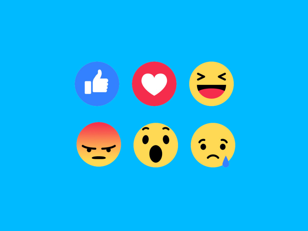 Since early this year users can not only 'like' a post, as-well show their 'love', 'laugh' out loud with 'Haha', show excitement and be amazed using 'Wow', may display that they are 'Sad' and get 'Angry' as they may feel to do so. Just general reactions in Cute Animated Emoticons. 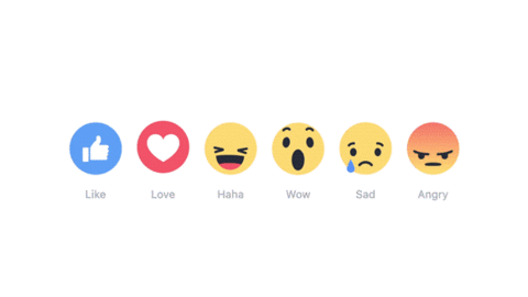 And so what they might be coming up with, during halloween...They will have a slightly glossier 'love', a witch laughing out loud on a naughty joke, a ghost who's amazed to see 'you' perhaps, a saddened green Frankenstein and an angry pumpkin, maybe he's angry coz someone carved out all the stuffings. All nicely done. 👍🏻 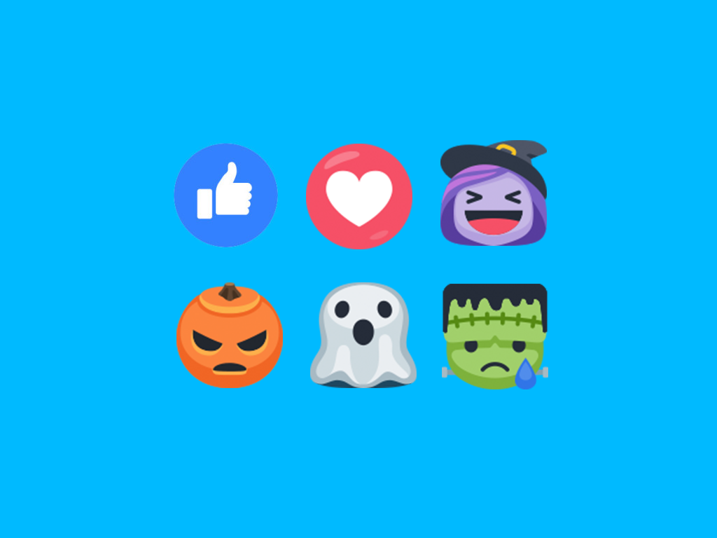 I like using reactions, and certainly I would, as a user, feel small updates like these, will surely have other users stay involved and curious to see what might be there in future, a trick or a treat? Either-ways, there are many who really get excited for such tiny updates. May be there will be another set for Christmas? well I am looking forward to seeing these set-of-6 Reactions in action.Kudos to designer(s) who worked on these. Keep up the great work. Cheers!
|