|
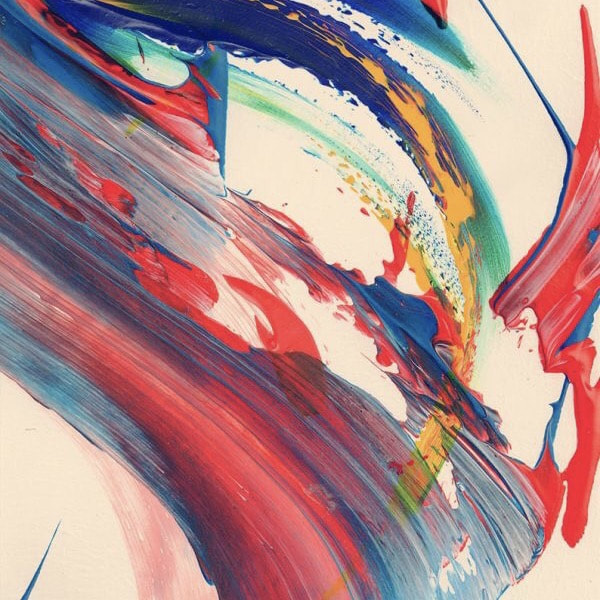
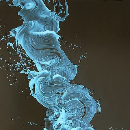
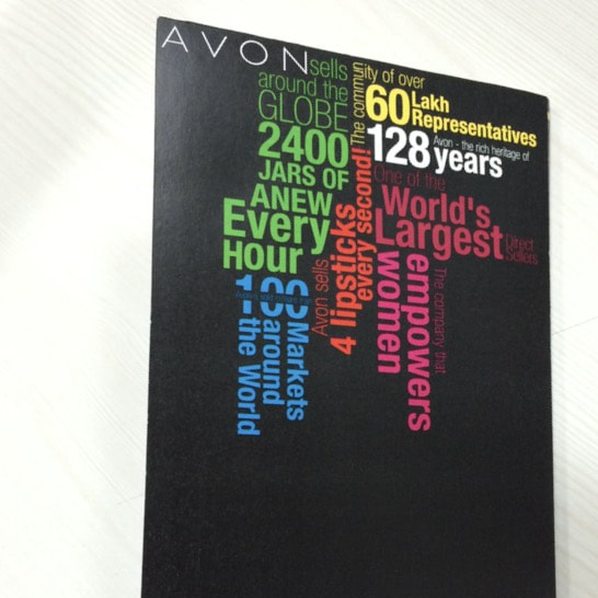
Designing always requires grids and layouts for neatness and clarity. Yet there are designs that may make you think otherwise. New trends defy the boundaries and sticking to layouts and grinds isn’t their thumb rule, as they just want to have fun. Which in turn makes this interesting and much more open to newness. But still, usually if you are using 90-100% layouts and grids, go out of your comfort zone and use abstract art for designing, and bring in only 5-10% of an element to be in grid, that’s where neatness strikes. Note closely, the abstract quotes in the design below, may look like they are not following any layout, yet there is a grid that is holding them together, with colors used to focus in a hierarchy. Will update this post with more examples.
0 Comments
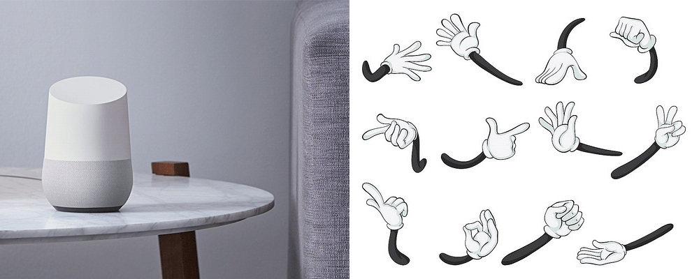
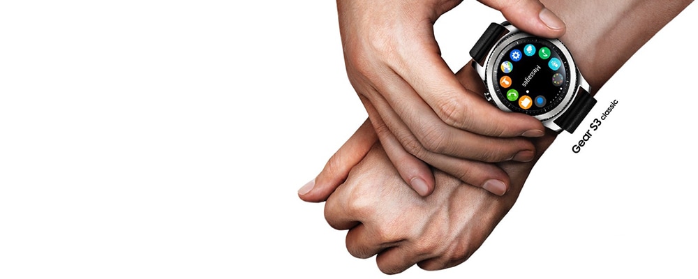
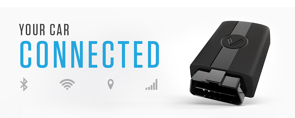
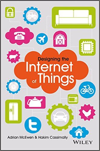
IoT continues to gain tremendous momentum, and even more organizational interest, to the tune of multi-million dollar investments. Companies like Google, Samsung, Ford, GE, and more have made tremendous organizational shifts, in order to fully understand and contribute in market to what many are calling the next big technological revolution. It’s both exciting and surreal. Exciting because of the potential to create intelligent environments, And surreal because many people still don’t know what IoT is, what it means, or even why it’s important to them. And it’s the very mystery of IoT that may guide the next wave of IoT adventure. As IoT continues to enter the mainstream medias, it needs to evolve beyond the technology and novelty of simply being connected. The value of IoT products needs to be clearly understood by consumers and seamlessly adapted to their lives. This is the challenge that all IoT products and/or experiences will need to solve, and why traditional UI/UX designers will play a key role in IoT’s continued evolution. As a developer of UI’s for almost 6 years now, I’ve recently begun shifting my focus towards IoT, beginning to craft some ideas around general design principles. Here are 5 principles that I believe are critical as we begin to consider the role of digital design: 1. Prepare for Evolving User gesturesJust as touch screens introduced the pinch, finger scroll and swipe; we’ll soon be introducing other ways of interacting with digital interfaces. We can expect that hand gestures will continue to be used, but we’ll also begin to see even more natural movements controlling our environments. With VR, our movements mimic those of the real world. Moving our heads up, down, and around allows us to explore the VR world just as we do ours. We’ll be able to control our environments through commonly used hand and arm movements. Voice will play a huge role. Even the act of walking will dictate some level of control. As these new controls become adopted by users, they will become the standard by which we interact in this space, whether a screen is present or not. 2. Leverage What You Already HaveAs IoT continues to grow and evolve, we’ll encounter never-before-seen devices with associated UI’s. For those of us who design to these new environments, we’ll need to strike the right balance between new and familiar UIs. As we create the UIs of the future, we’ll need to call upon those things that have become standard expectations among users. By evolving from what is already known, the potential of new technologies can be harnessed while maintaining enough familiarity to be usable by the user. It’s safe to say that things like the ‘menu’ will always be a part of the experience. And just as we saw the introduction of the hamburger menu once mobile became a demand, we’ll need to explore its evolution even further within IoT environments. You need look no further than wearables like Samsung’s Gear S2 Watch to see how menu controls might evolve. 3. Create Contextual ExperiencesIoT will achieve mass adoption by consumers when products are easily understood and seamlessly integrated into their lives. To me, this means that we need to expand beyond personalization, and begin to infuse context into the experience. Context means timely and purposeful. Context allows for experiences to be meaningful and valuable. So as we develop the experiences that will drive IoT, we need to understand that being inconspicuous, far from being a bad thing, may be the goal. When the IoT product knows you, knows where you are, and knows what you need, it will only become present as needed. Things will adapt to people, and before we know it, become fully integrated into our daily lives and habits. 4. Account for Premeditated ActionsOne of the most promising characteristics of IoT is the ability to predict and adapt to situations. The same could be said of the user interface. The old model of singular actions driving singular reactions will need to evolve. We’ll begin to see interfaces that can predict a series of steps for you. A simple gesture, movement, or word will initiate a series of useful events. There will even be reactions that aren’t initiated at all. The Nest learns our habits and adjusts intelligently without us needing to get involved. As we develop the UIs for this new dynamic, we’ll need to understand that user views will change constantly. At times we’ll need to allow for controls, while at others we’ll need to account for some sort of measurable component. And each view will be intelligently displayed, in the context of that very moment. 5. Last BUT Most Importantly, Connect People!While all of the above are impactful, yet we mustn't lose vision of the fact that we are ultimately linking people, not the products. All the exposure need to open up dialogues and interactions, rather than encouraging people to be introvert even more. While we look towards a fully connected future, connecting us all to one another in meaningful ways will allow for more interaction and, eventually, more productivity. Fingers crossed. The future of IoT, and the role that digital design will play, is all about empowering and enabling people in ways that previously required a tremendous amount of effort or to inherit knowledge. This isn’t about cutting corners, it’s about gaining an individual expertise or experience that will benefit the whole community. We’re for sure are seeing tremendous advancements in the field of IoT. The next step will be for us to allow for user interactions that are useful and predictable, so that these technologies become more than just technologies, and instead become a meaningful way of interaction, prediction and adaptation. Here are A few books for you to learn moreA few books if you re keen to learning more about IoT. Hope this helps you evolve your own skills. Cheers!
Hey all, well to begin with since this is for September and I personally find September a month of self exploration month and a almost change of season. I really wanted to share something interesting enough for what can really differentiate between a real designer and an amateur. If you can't understand these examples, then seriously, take your hired designer more seriously or just change your profession. Cheers.
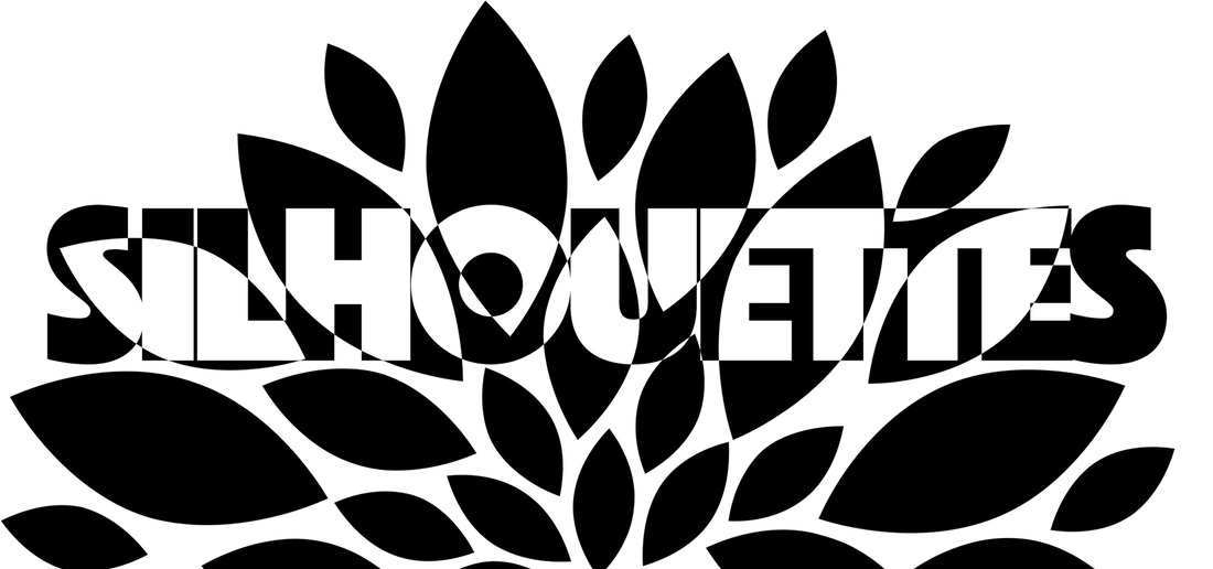
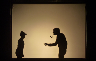
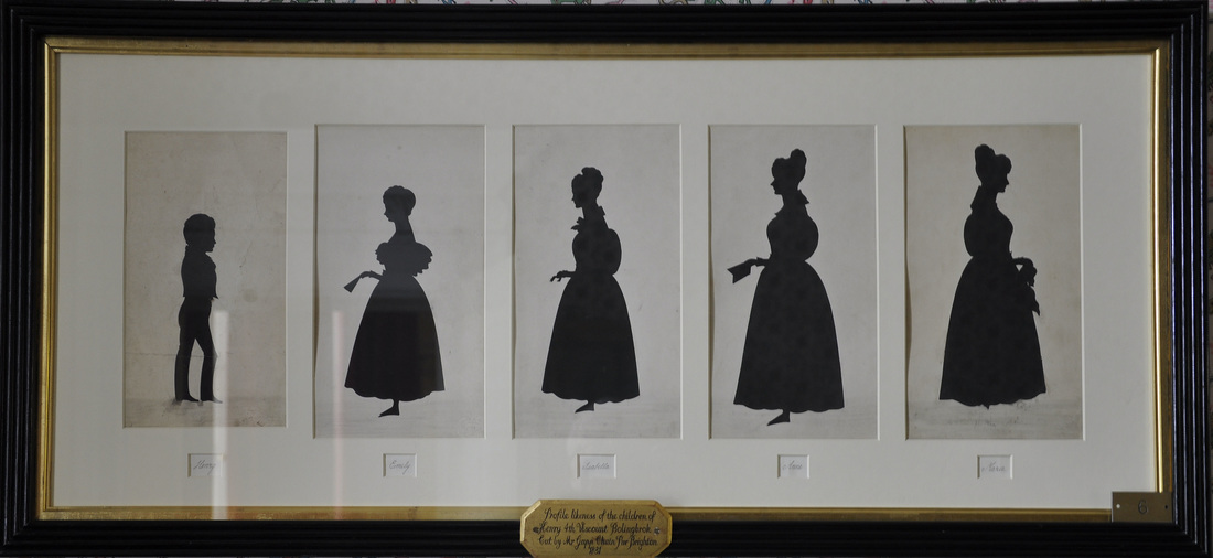
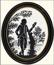
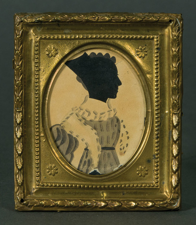
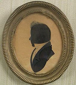
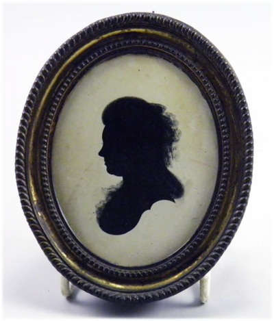
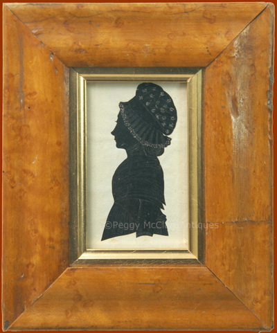
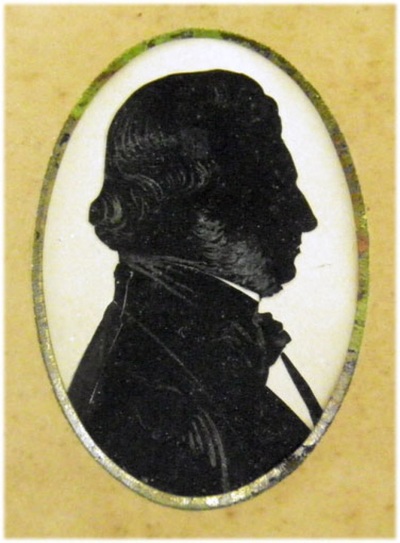
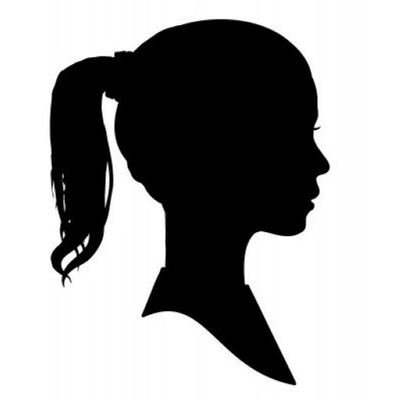
It's mostly all about silhouettes. For the Dezign Inzpiration issue 7 I'll focus on Silhouettes one of the many forms of art I love to play with in design as well in my drawings, Silhouette is an all-time favourite. What makes it one of the most recognized forms of art is the fine detailing and intricate aesthetics. For those who don’t know what a ‘silhouette’ is… In simple terms it's any image represented as a solid shape of a single color (usually black) against a lighter coloured background. We can define silhouette as a filled outline of any person, animal, object or scene, only more detailed while its interior is featureless and in solid color. For a better understanding, a very simple example to explain silhouette is shadow theatre. In this particular form of theatre the artists perform behind a screen and not in front of it. Either flat articulated figures (shadow puppets) are used to create cut-out figures which are held between a source of light and a translucent screen or the artists themselves act behind the screen to display shadows that tell stories. The cut-out shapes of the puppets are highly detailed and are used to achieve various effects by moving them. The practice of silhouette initially used to create portraits. Prior to the advent of photography, silhouette profiles cut from black card were the cheapest way of recording a person's appearance. It started as a cheap but effective alternative to the portrait miniature, and skilled specialist artists could cut a high-quality bust portrait, by far the most common style and was very popular in the mid-18th century. Here are a few apps for silhouette related functions. And here a few games And some music Though how this word came in existence is a very interesting story.
The word silhouette derives from the name of Étienne de Silhouette, a French finance minister who, in 1759, was forced by France's credit crisis during the Seven Years' War to impose severe economic demands upon the French people, particularly the wealthy. Because of his austere economies, de Silhouette's name became synonymous with anything done or made cheaply and so with these outline portraits. The term silhouette, although existing from the 18th century, was not applied to the art of portrait-making until the 19th century. And since then it has become a great part of many ways. So keep making and innovating how else you can use this cool form. It is always fascinating for me to explore and try to evolve, I am sure every creative thinks alike. So here are all the DD logos designs that I sorta had to check out before I finally felt "This is it!" regardless, I am sure many of the DD logos creatives you may have seen in past or perhaps relate to. The Idea was to simply have the most minimalistic and symbolic logo. As well as this blog shares the next Dezign Inzpiration Issue 5th for this year. As you can see above, how each one f them has a distinct quality and look. yet they all are DDs. Yet, I wanted something that can easily be used any where, be it websites, print, or even sketches, without worrying about it's colors and shape. That should fit right in place with whatever shades that already exist. So I made it some what close to the 3rd in the 4th row. (No.15) and have it flat, no strokes. with a transparency that helps in color flow. And yet it stays classy, exactly how I want my brand to be. So, anywhere and anytime you see DD, DezignerDude to comes in mind.
|
