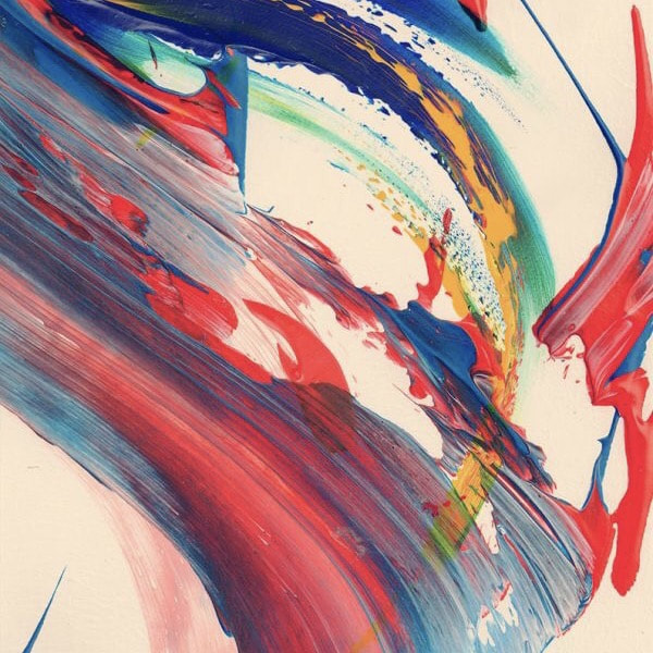
 Designing always requires grids and layouts for neatness and clarity. Yet there are designs that may make you think otherwise. New trends defy the boundaries and sticking to layouts and grinds isn’t their thumb rule, as they just want to have fun. Which in turn makes this interesting and much more open to newness. But still, usually if you are using 90-100% layouts and grids, go out of your comfort zone and use abstract art for designing, and bring in only 5-10% of an element to be in grid, that’s where neatness strikes. 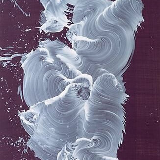   Note closely, the abstract quotes in the design below, may look like they are not following any layout, yet there is a grid that is holding them together, with colors used to focus in a hierarchy. Will update this post with more examples. 
0 Comments
Everyone has different ways to love and since the week of love is going on and Valentines Day just a week away, here are some of those various feelings on greeting cards to show your love if you are keen and affectionate. Greeting cards are really not good when sent virtually, they mean more to people when they are sent in-person/physically with hand written notes. It's Perfect and STILL works for showcasing your emotions. 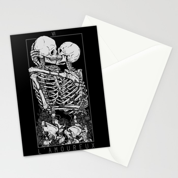 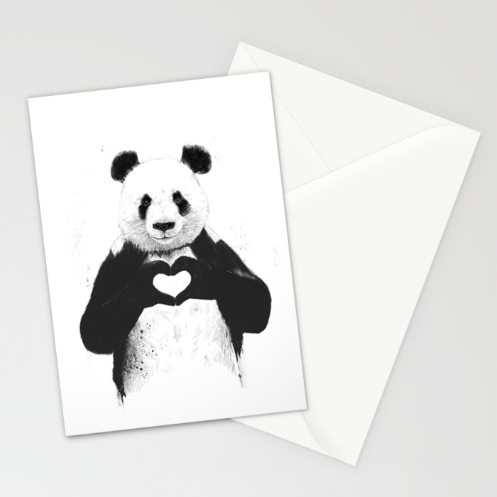 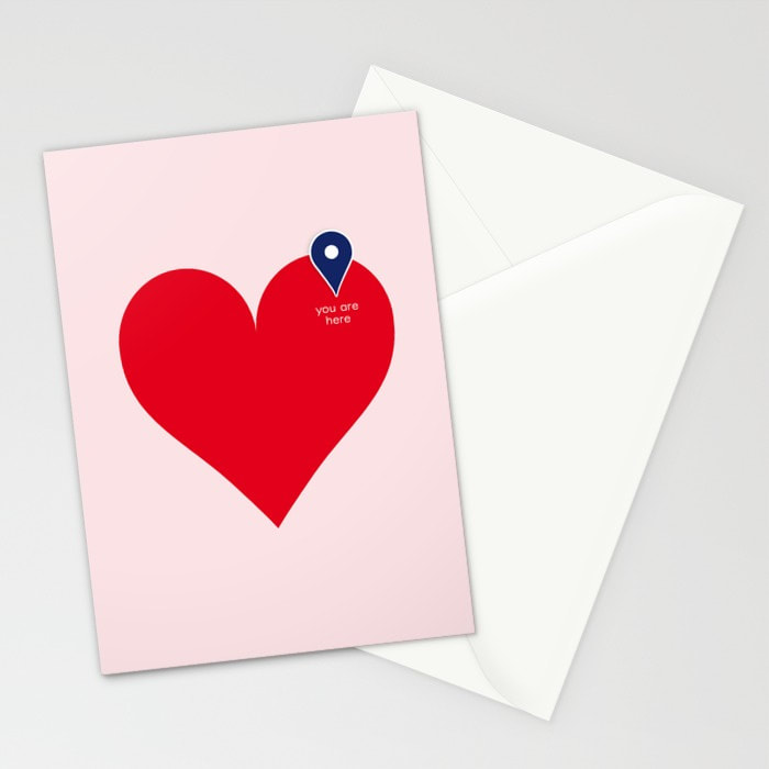 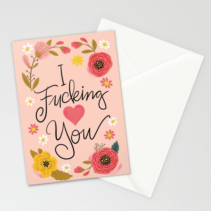 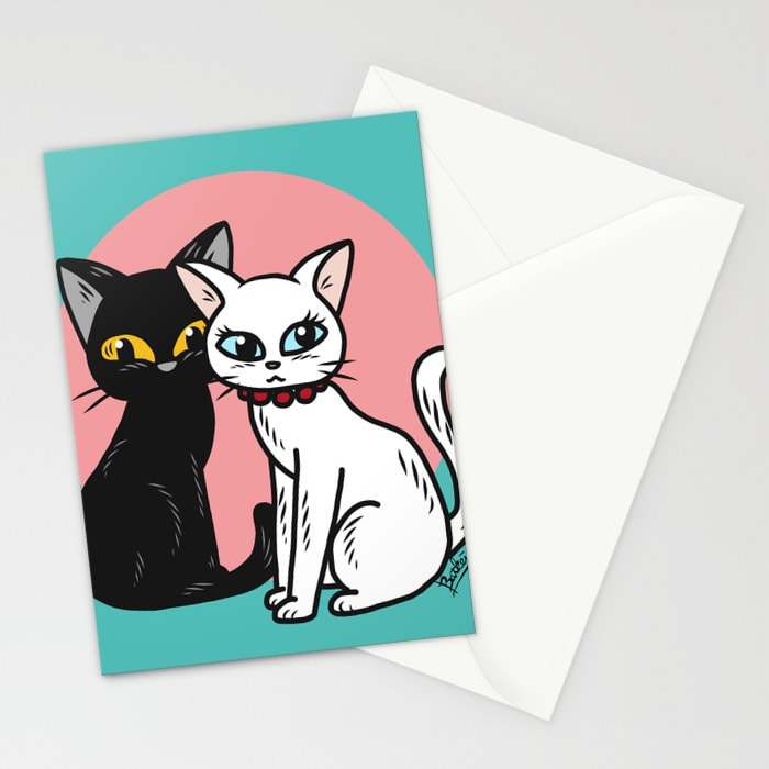 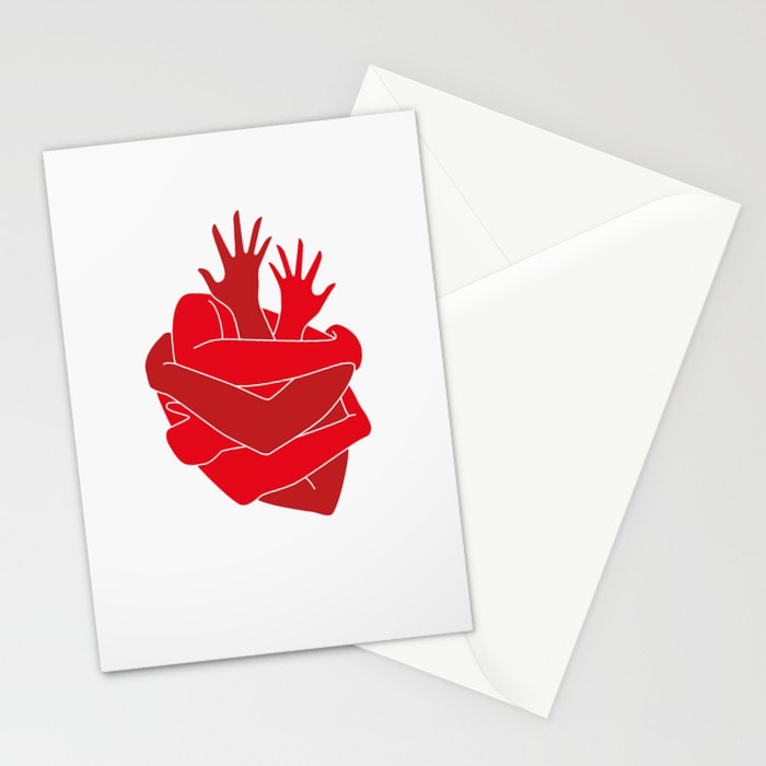 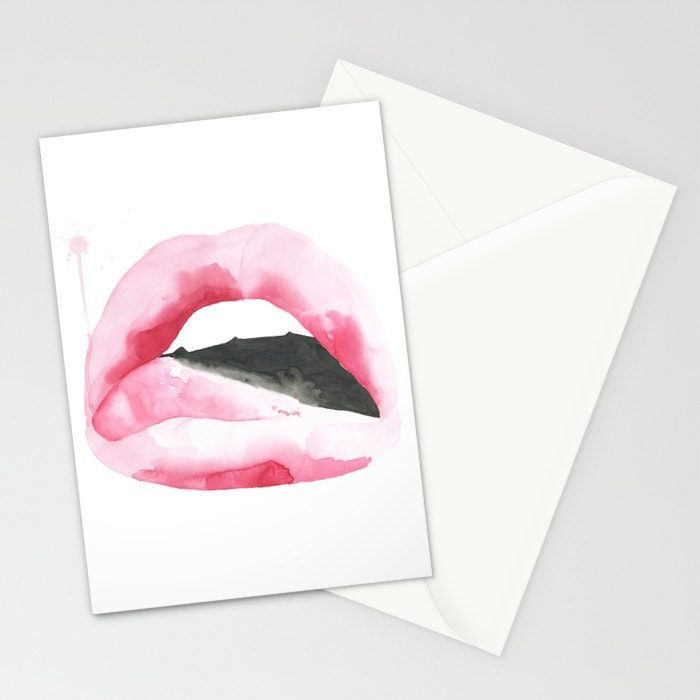 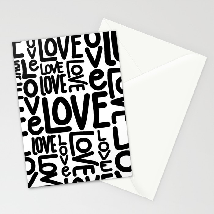 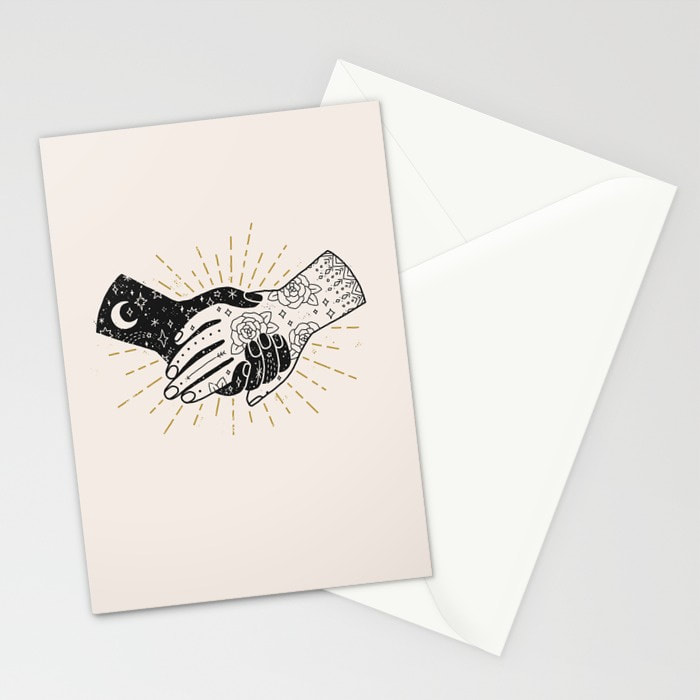 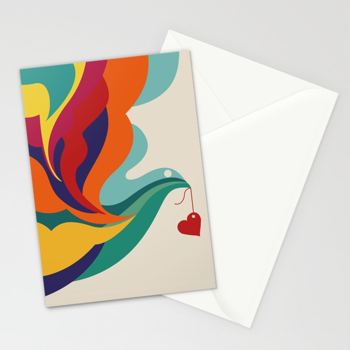 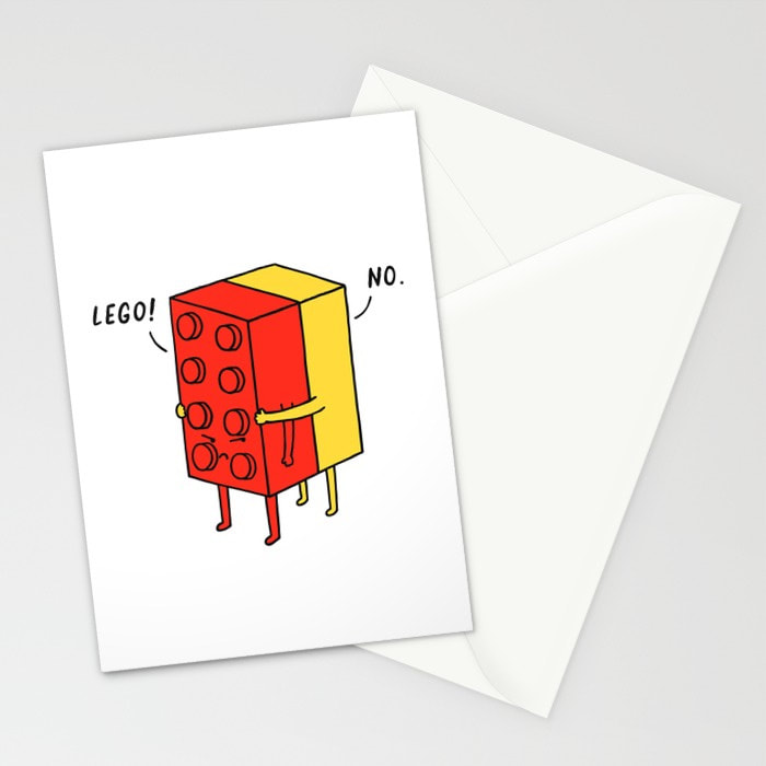 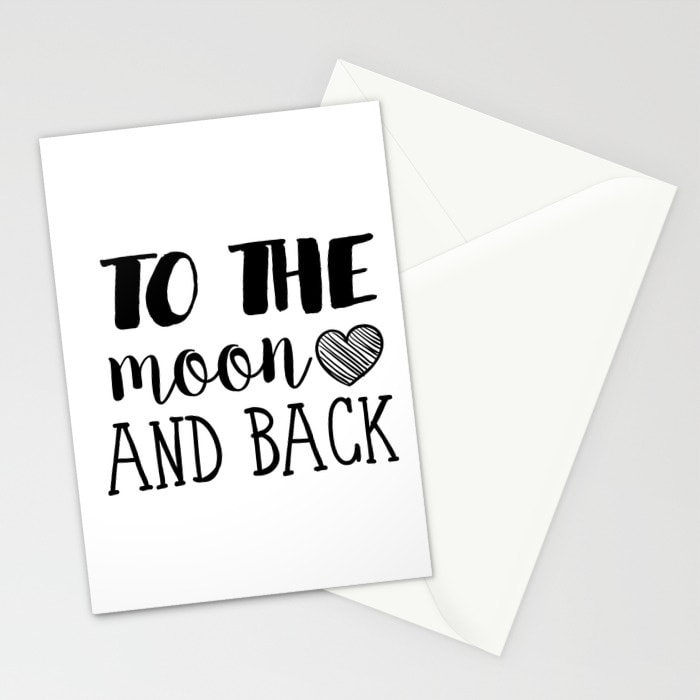 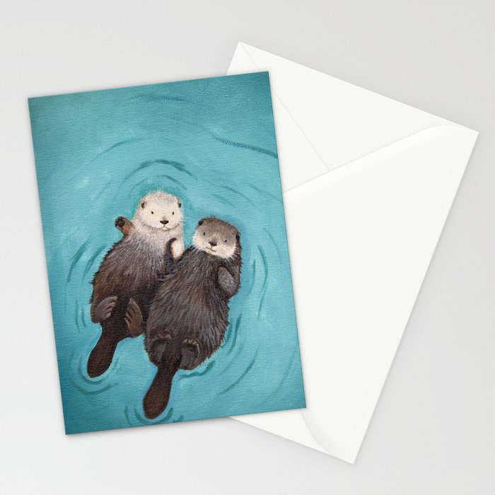 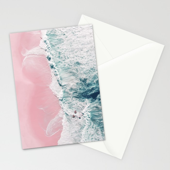 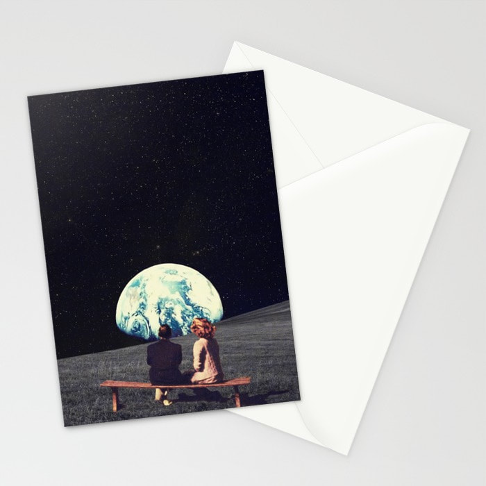 Which ever card you choose, the ultimate goal is to decoratively send your love in physical form instead of virtual an emails or a sms. So pick one and sent it!
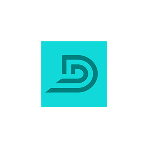
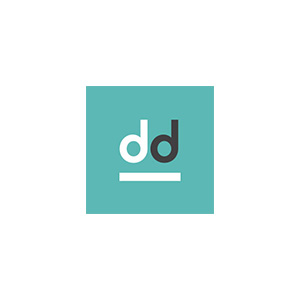
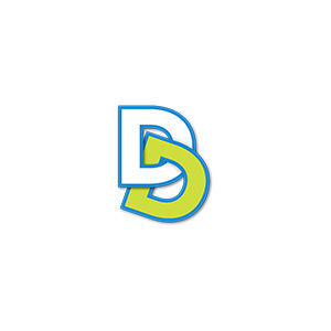
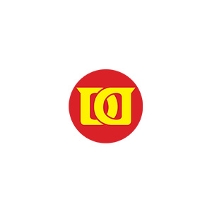
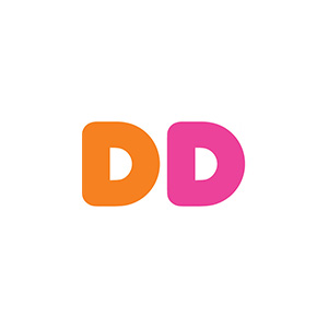
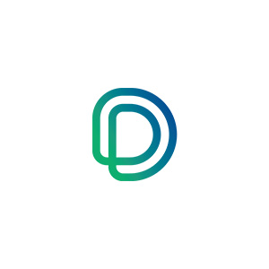
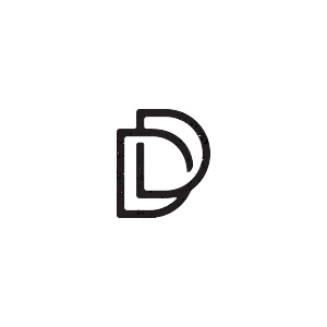
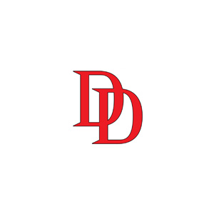
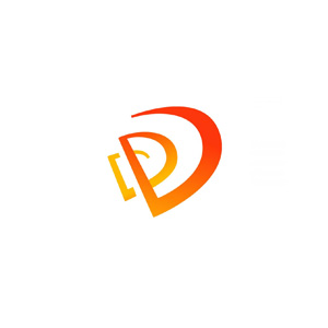
It is always fascinating for me to explore and try to evolve, I am sure every creative thinks alike. So here are all the DD logos designs that I sorta had to check out before I finally felt "This is it!" regardless, I am sure many of the DD logos creatives you may have seen in past or perhaps relate to. The Idea was to simply have the most minimalistic and symbolic logo. As well as this blog shares the next Dezign Inzpiration Issue 5th for this year.
As you can see above, how each one f them has a distinct quality and look. yet they all are DDs. Yet, I wanted something that can easily be used any where, be it websites, print, or even sketches, without worrying about it's colors and shape. That should fit right in place with whatever shades that already exist. So I made it some what close to the 3rd in the 4th row. (No.15) and have it flat, no strokes. with a transparency that helps in color flow. And yet it stays classy, exactly how I want my brand to be. So, anywhere and anytime you see DD, DezignerDude to comes in mind.
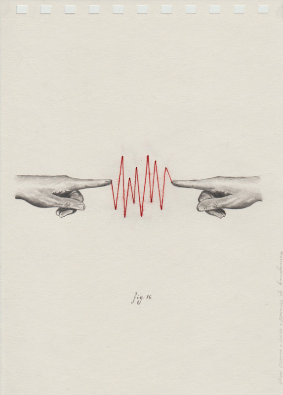
Basics design principles must be understood before preparing a set of layouts, although only a few considerations are suitable for the designer for use in preparing a graphic two-dimensional layout. Nine of the most important considerations reviewed in simple illustrations here are, 1 Balance, 2 Alignment, 3 Emphasis, 4 Proportion, 5 Movement, 6 Pattern, 7 Contrast, 8 Unity and 9 Perspective. We can name Design Principles in many ways and with variety of examples, and I shall continue to write more to help out those who are looking forward to a future with design. Just get your principles of design right. These simple illustrations were made using Adobe Illustrator, and you may as well use Adobe Comp CC, yet there are many other software. 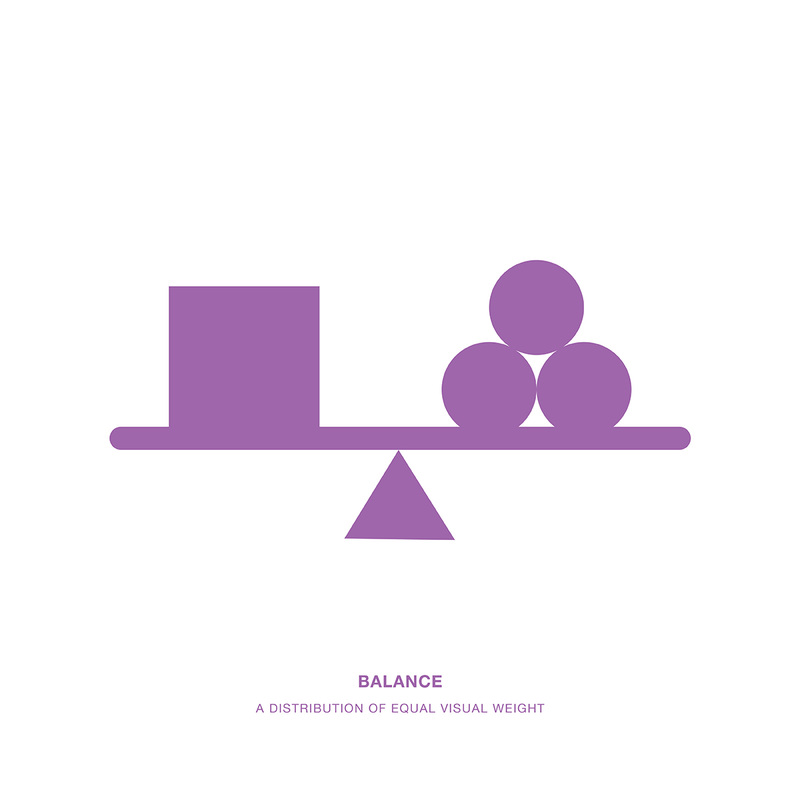 Balance - A distribution of equal visual weight 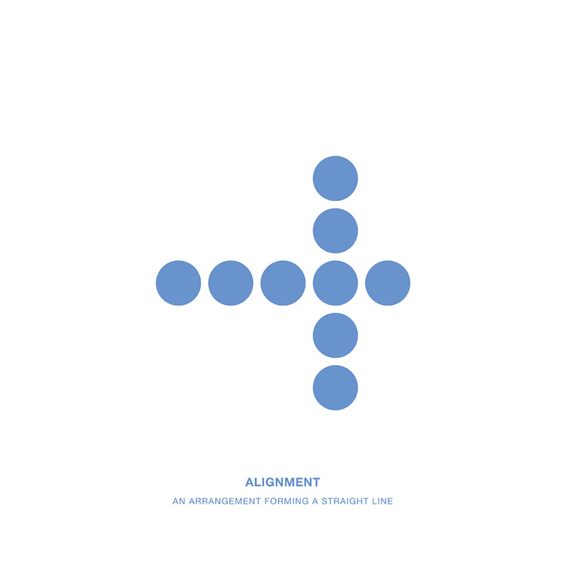 Alignment - An arrangement forming a straight line 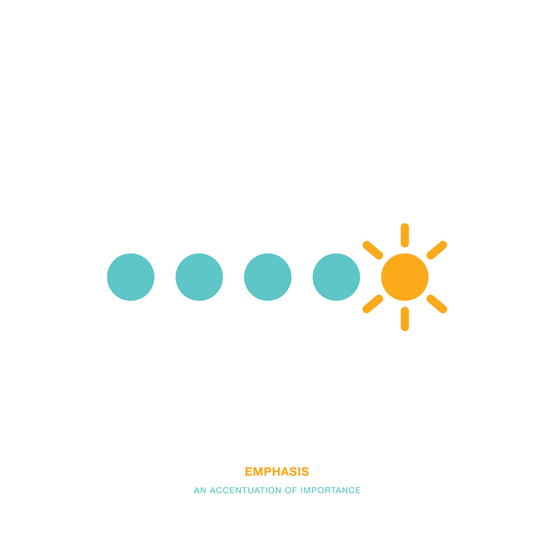 Emphasis - An accentuation of importance 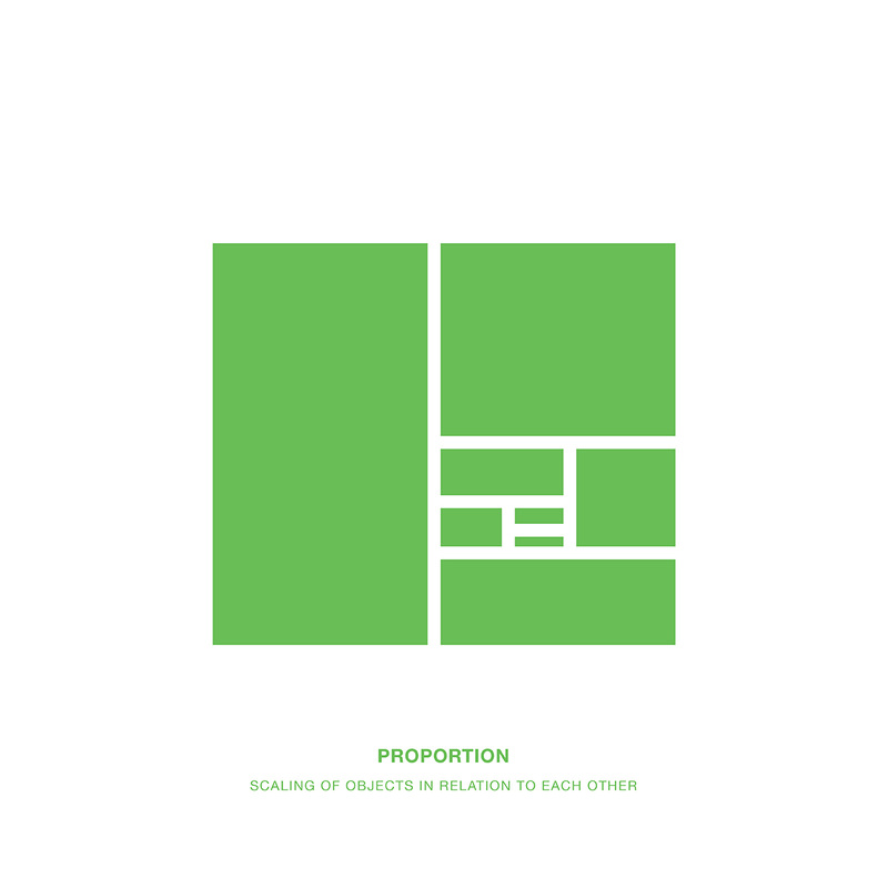 Proportion - Scaling of objects in relation to each other 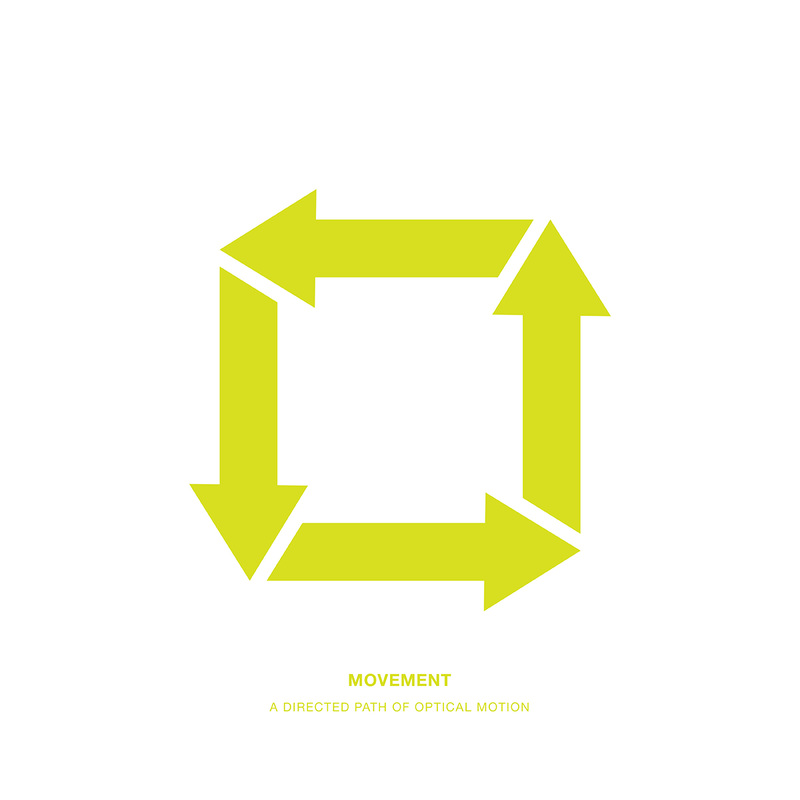 Movement - A directed path of optical motion 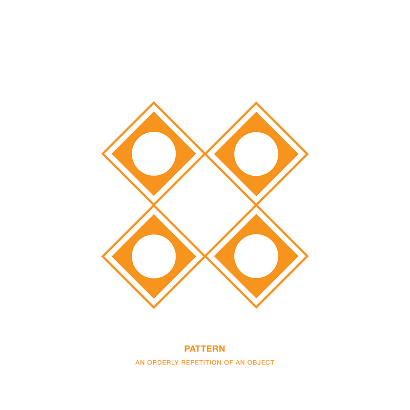 Pattern - An orderly repetition of an object 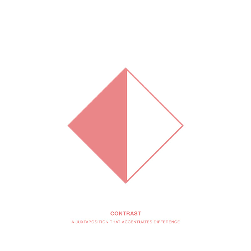 Contrast - A juxtaposition that accentuates difference 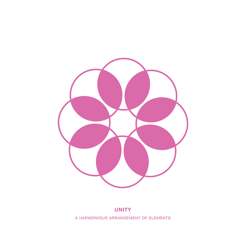 Unity - A harmonious arrangement of elements 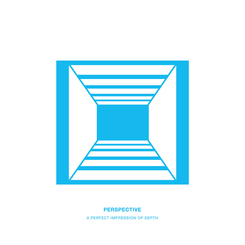 Perspective - A perfect impression of depth
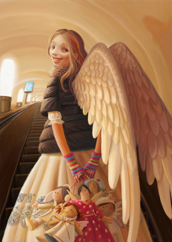
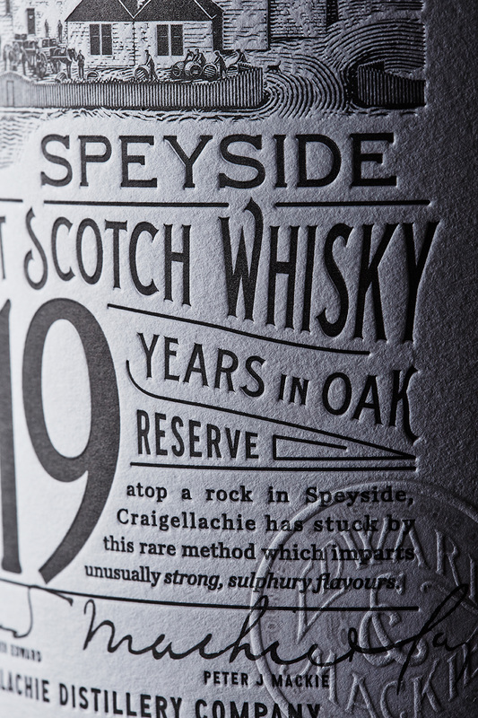
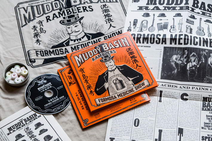
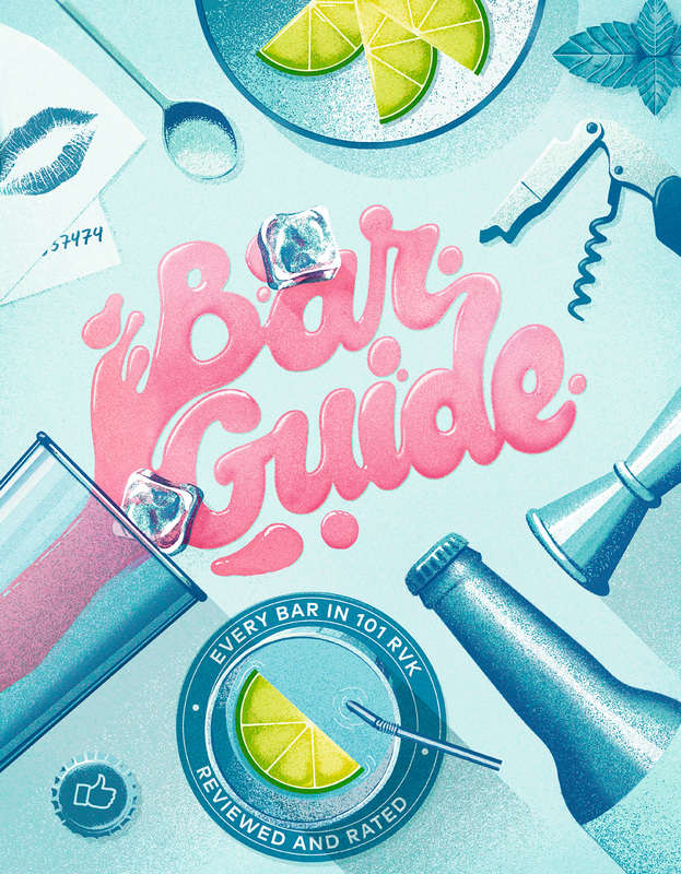
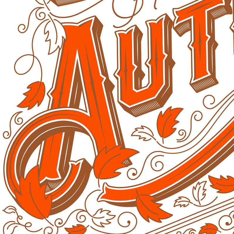
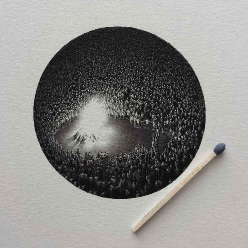
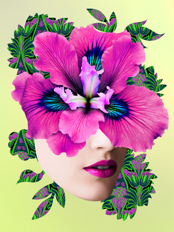
3rd Dezign Inzpiration issue of 2016 for graphic designers and creatives. Kudos to Cool Artists and Designers among us. Featuring some of them here. Cheers!
|