
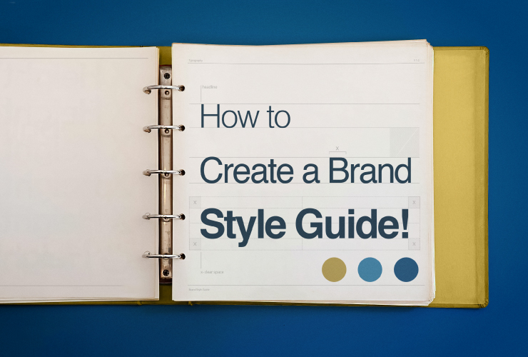
 What is a Brand Style Guide?Before creating a Brand Style Guide, your designer needs to have created a set of visual brand elements. Then those design elements should be brought together into a set of visual standards within a brand style guide. Discover more here on: ‘How to create a strong brand identity’ No matter what size your business is, a brand style guide is essentially the glue that holds together your visual brand identity. Whether you’re a small business, a large organization, or just starting, a brand style guide is an invaluable asset that helps build trust in your brand. Think of your brand style guide as your business’s primary visual DNA – A practical document that contains specific, detailed rules about logo usage, typeface systems, color palettes, layout guidelines, and so much more. The purpose of a brand style guide is to establish and enforce a set of design element styles – so that all of your design collateral and marketing material will have a cohesive look that matches the voice of your brand. A brand style guide will save you time and energyWithout a brand style guide, every interaction you have with the professionals creating marketing graphics for your brand will come with headaches. You will have to explain your brand vision and the look you want to achieve every single time. Whether it’s a printer delivering business cards, a web designer creating a new sales page, a book designer doing your ebook, or a social marketer setting up an ad campaign and creating social media posts – if you don’t have a brand style guide, your presentation will vary and you’ll find that you keep saying “that’s not how I want it to look”. Having a brand style guide will save you wasting time and energy, so you can focus on growing your business and brand. 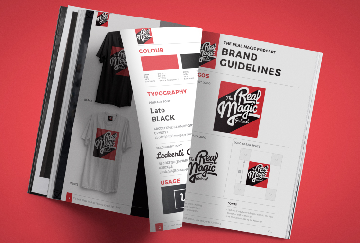 Why every brand should have a style guideHaving a brand style guide allows you to have a congruent look and feel for all of your marketing so that you look more professional and more trustworthy. The brand style guide helps all the creatives who work on your brand including; website designers, social media designers, stationery designers, videographers, signage designers, etc. They can all follow the same set of guidelines to make sure your assets are used professionally. That way you will have a consistent look across all of your marketing. Your suppliers will easily stay on target and deliver a unified look for your brand. Without a style guide, you risk inconsistency across your marketing. If you’re not consistent, your brand will end up appearing unprofessional and you will appear making your brand less trustworthy. It’s a crucial control mechanism for your brand. 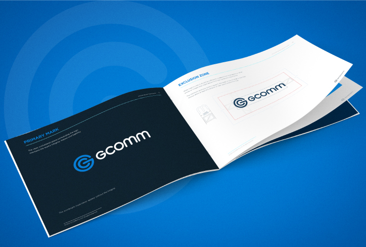 What should a brand style guide include?A brand style guide is like a great recipe and has many ingredients and instructions. Some of these key ingredients include: Verbal Summary: Be sure to include a verbal summary of your brand at the beginning of your brand style guide. This can include your brand’s mission, core values, your brand personality, your brand vision, your brand’s target audience, and your brand’s story. This is extremely helpful for creatives to read before they design for your brand so they truly understand what your brand is all about. Logo: Your logo is your brand defining symbol and is one of the key elements in your brand style guide, so be sure to include images and specifications of:
Logo Rules: Establishing a detailed set of rules for your logo usage is important for brand consistency. Especially as your logo will be represented in a wide range of branding touch-points. Logo rules to consider:
Logo DO NOT’s – Logo treatments to avoid Show examples of how the:
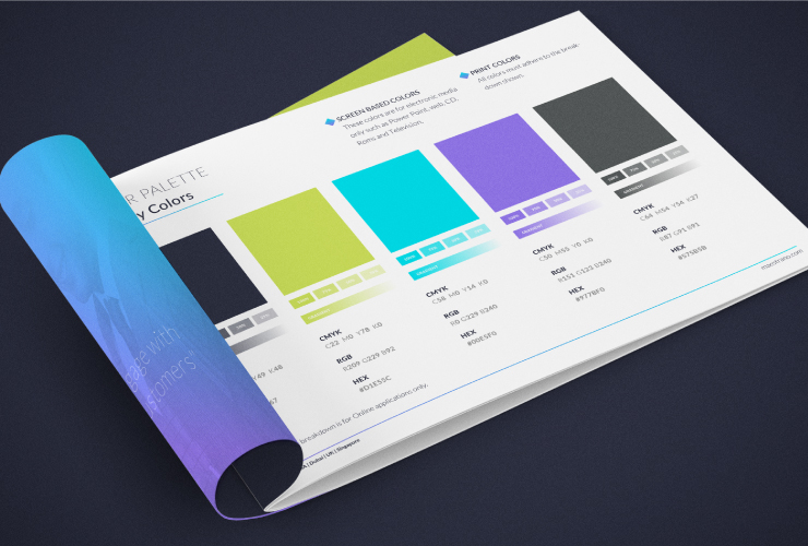 Color: Your brand’s color palette is generally made up of primary and secondary colors. Your primary colors may be derived from your logo or they may stand alone. This palette may also include a ‘Call To Action’ button contrast color. Your secondary colors are usually complementary to your primary palette and may be made up of subtle variations to your primary palette. This allows for more scope and flexibility in the design process. Colors require different values and settings on various printing processes and devices. Always include print and screen/web color equivalents. For print, including CMYK and Pantone references, while screen/web colors are often defined in RGB and HEX codes. 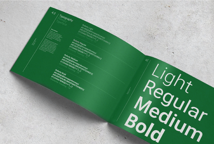 Typography: Typography refers to the font (or typeface) you choose for your brand identity. Your brand style guide needs to exactly spell out which font families to use for your brand and in what situations and for what specific purposes. Most brands use 1-2 primary fonts and 1-2 complimentary secondary fonts.
Pattern & Texture: This section will include: Background, branded patterns, icon pattern repeats, textured pattern repeats, etc. 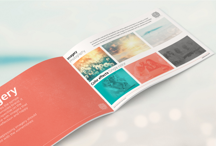 Imagery & Photography: Your images are one of the most powerful sets in your brand style guide as they create a mood, evoke an emotional response, tell your story and showcase your products or services. Here, you’ll need images in many aspects of your brand, from your website and social media activities to (potentially) your logo and content-marketing initiatives. This part of the guide aims to educate anyone who works on your brand’s marketing on what sorts of photography is appropriate for your brand and what compliments it. It’s also good to show examples of the type of images you don’t like. This section will include photography styles, lighting, composition, color hues, etc. 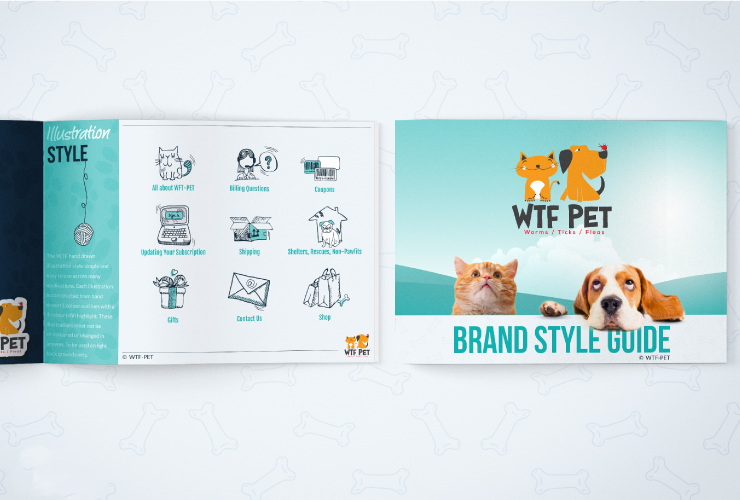 Illustration: This section will include Icons that support your products, your programs, your USP, your explainers, your instructions, etc. 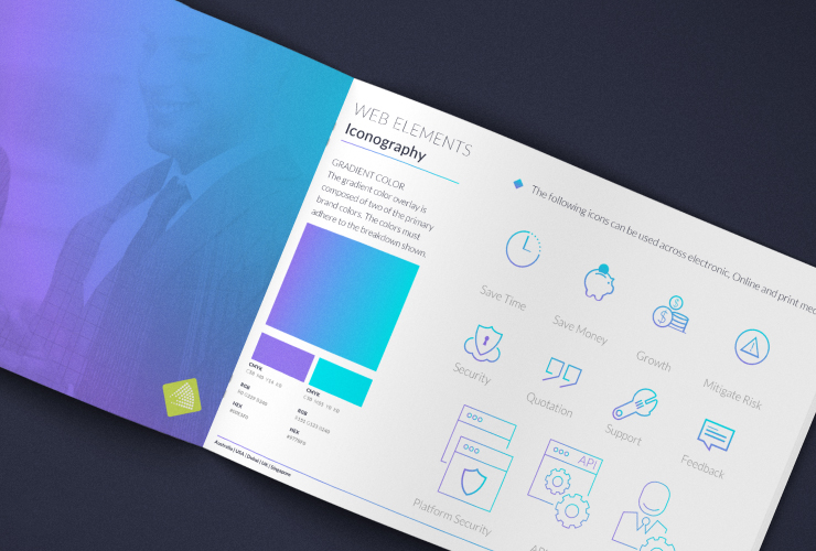 Website elements: Websites often have multiple pages so it’s worthwhile to define how certain elements on the web pages should be styled so that developers can keep these elements consistent across all pages. This includes:
Closing with, style guides are not set in stone. They are living, evolving sets of guides that creatives and brand developers should use as a baseline when designing for your brand to ensure you get a cohesive visual voice for your brand.
Invest in a brand style guide early, to make sure you always make a great first impression.
0 Comments
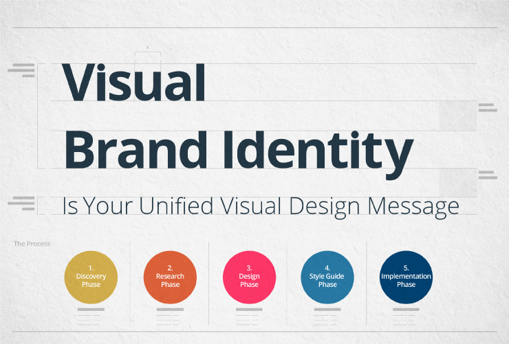 A lasting impression begins with a powerful visual brand identity.Your brand identity is a unified set of visual elements that affect the way people perceive your brand and what it means to them. This is important because if your visual identity isn’t congruent and appealing, then your prospects may not take you seriously. Even worse they may purchase from your competitors instead of from you – just because your competitors LOOK more professional. All the visual elements throughout your business should be designed to communicate your brand’s values and voice in a consistent way. This includes your logo, your color palette, your typography, your imagery, your packaging, your website, your social media, your print media, and all other visual communications across all of your marketing & product delivery touch-points. Here's a 5 step process to show you how to create a strong brand presence that will resonate with your target audience
 STEP 1: Brand Discovery PhaseBefore you hire a designer, get clear on your brand values. Take the time to put into words, what your brand represents and how you want it to be remembered. Get clear on what the purpose of your brand is and what problems your brand solves. Good designers ask about your brand. A great designer should have a process around this discovery phase. The right designer will have a design questionnaire that asks you a series of foundational questions about your brand so they can discover everything they need to know about your brand before they start designing. Provide your designer with as much detailed information as possible about your brand’s target audience and purpose. For example, when asked about your target audience, a one-word answer like ‘women’ is too broad. A better answer will include things like Gender, Age, Profession, Geographic location, Socioeconomic status, Frustrations, etc. Describe the feeling you want to evoke from your target market with your brand. Remember that people buy with emotions and then justify later with “logic”. Visuals are a key part of hooking your audience emotionally to draw them closer to your brand. You’re making a long-term investment, so think beyond today. Describe your objectives for your brand and where you see your brand 5 years from now. Your designer will be able to create a better result if you provide as much clarity and information as you can. The goal of the discovery phase is for your designer to truly understand what your brand represents and your vision. Once your designer has this knowledge they can move confidently to the research phase. 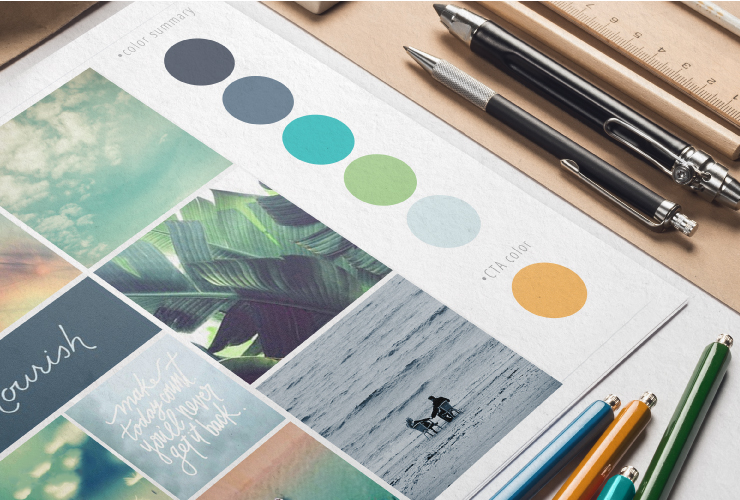 STEP 2: Brand Research PhaseCreating a new brand identity requires a similar approach to starting a new business. This means the research phase is a critical piece to making sure that your brand is unique and has a place in your niche. Once your designer is clear on the brief, they should spend time researching your competitor’s websites and social media platforms. This will ensure your brand identity will be truly unique and NOT similar to your competitors. Your designer should also study your target audience to see where they hang out on social platforms, what they like and dislike, who they follow, what else they are into, what type of music & films they like, etc. Remember, the goal is to create a brand identity that resonates with your target audience, so the more your designer knows about your audience, the more they can create a visual identity that is likely to appeal to that audience. While your designer is researching they should be collecting visuals along the way. This is all part of the creative process. Your designer will also be drawing on other reference points and their talent. At Studio1Design, we start by researching the competitive landscape. We also explore branding trends relevant to your marketplace and brainstorm creative ideas as a team. For this reason, there can be a huge amount of design ideas developed. So it’s vital to refine the process further and eliminate 90% of what’s collected and keep only the stuff that will make sure your brand identity direction is original and unique. Then we will provide you with conceptual ideas and direction of how your brand identity could look aesthetically with brand ‘mood boards’. The brand mood boards take all the text-based information and conversations from the ‘discovery phase’ and translate it into visual concepts. A mood board is essentially a collage of images, textures, patterns, colors compositions, design styles, elements, and fonts. An effective mood board will tell a story that defines your brand and communicates your brand’s new identity direction. This may involve a couple of varied design style directions and color palettes presented to you to nail down what aesthetics you like the most out of the concepts provided. Brand mood boards are a key design tool for defining the overall style, aesthetics, and visual language of your brand. They are a great way to establish the tone of your brand and allow you to see what you like and what you don’t like. Once you decide which direction you like the most, you have a strong design foundation. You will be excited to see what your designer creates and you will be confident that it will be as per the direction you have agreed to. Brand mood boards streamline the design phase process. They make sure that the look of the final graphics and design elements will be on track so that the designer doesn’t go off on a tangent. 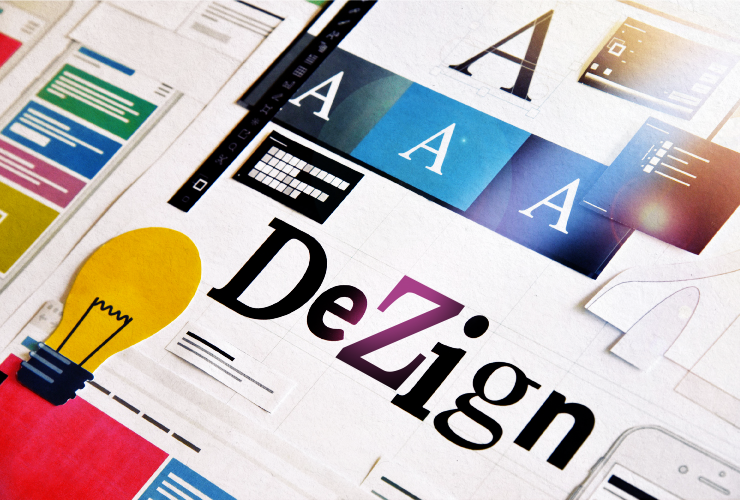 STEP 3: Brand Design PhaseAfter your designer has determined your target audience, clarified your brand voice, conducted market research, and defined the various elements of your brand via mood boards, it’s time for the fun part, the design phase. In this phase, key design assets are created – the building blocks for all your ongoing branding. The aim here is to make sure that every element is designed to complement and visually succinctly enhance your brand. These design assets are the building blocks of your visual brand identity and need to work harmoniously together to tell your story. They need to be flexible and need to work across all of your branding touch-points. For a new brand The design needs to stand out with your unique look so that your brand becomes memorable over time. Rebranding For an update to an existing brand, you need to be clear about where the brand has been where it is going. You want to make sure that the new brand won’t confuse existing customers while enticing new customers at the same time. So if possible keep part of the previous visual identity as a design element within the new brand identity. This could mean keeping the same colors or the same icon or the same supporting elements, etc. Don’t keep all of them – just use one, so that your existing customers will identify with the new look. Brand design elements Your visual brand identity can be expressed with any number of design elements, including:
Your designer will need to know where you intend to use your branding elements, so they can make sure the designs will work across the different purposes, including;
If you have signage made or shirts printed or embroidered, there may be limitations on how many colors you can use, so your logo needs to be adaptable to suit. Color can be a huge part of your identity, however, don’t let it be the most memorable part of your logo. The best logos also work well as a one-color logo.
It’s much better to have a simple logo instead of a detailed logo because it’s easier for your audience to remember. However, it’s much harder to create a simple logo, compared to creating a detailed logo. This is because the logo needs to represent your brand – so the more you take away, the less there is remaining to work with. It’s much harder to represent a brand with only a few lines or shapes. Once you have your logo and brand elements finalized, from that point you will want to make sure that all of your marketing touch-points consistently represent your brand. This is why it's recommended to have a brand style guide. 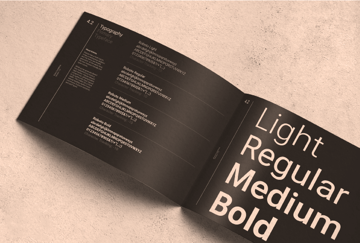 STEP 4: Brand Style Guide PhaseA brand style guide is the core of your brand identity. It’s a practical document that contains in-depth rules about your logo usage, typefaces, and color palette codes for use online and also for offline printing, layout guidelines, the image uses, and so much more. The purpose of having a brand style guide is so that all of your design collateral and marketing materials will have a cohesive look. This means you can give your brand style guide to all the creatives that work on your marketing, from website designers to social media designers, to stationery designers, to videographers, to signage designers, etc. They can all follow the same set of guides to make sure your assets are used professionally, to ensure you will have a consistent look across all of your marketing. Without a style guide, you risk inconsistency across different marketing & advertising platforms. If you’re not consistent, your brand will end up appearing unprofessional and lose identity, making your brand less trustworthy. It’s a crucial control mechanism for your brand. Brand style guides are as important for a small business as they are for a large business. They are a tool that will help you with consistency. Consistency is one of the key psychological drivers that influence people to take action, so be thorough when you start implementing the branding elements. 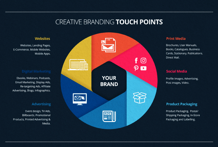 STEP 5: Brand Implementation PhaseThis is where you get to see your visual brand identity take shape and where it gets really exciting. Your brand identity design assets should be planned constructed specifically to engage your prospects and customers, to give them the best brand experience that’s consistent across all your marketing touch-points. Your marketing touch-points are any point where your prospect or customer engages with your brand, before, during, or after they purchase something from you. Here are a few examples of branding touch-points where you will benefit from having a strong consistent visual brand identity. Website & Landing Pages: Your website is where your brand identity should come through in full force. Your website is one of the most representative aspects of your brand identity. Your website is the hub of your business and is where your prospects will go to check you out before deciding to do business with you. You can’t afford to have a poorly designed website in a highly competitive market or you risk your prospects thinking that your delivery capability is no better than your website. Digital Marketing: Everything that you do online should be consistent: Ebooks, Webinars, Podcasts, Email Marketing, Display Ads, Retargeting Ads, Affiliates, Blog Posts, Podcasts, Videos, Slide Decks, Infographics, etc. Advertising: The more consistent you are, the more you will be trusted, so TV Ads, Billboards, Promotional Products, Printed Advertising, Point Of Sale, Events, etc. all need to match – and match your online presence. Social Media Content: Social media marketing is all about original visual content. Your brand must be instantly recognizable. You need to ensure your brand image is consistent on all your social media sites. This includes profile images, advertising, post images, video, etc. Product Packaging: Even your products should be part of your marketing. The products you sell and the packaging in which they come in, from product packaging, postal/shipping packaging, to in-store packaging and labeling, etc. will work smarter for you if they match. Print Media: Don’t forget what you put on paper. Brochures, User Manuals, Books, Catalogues, Business Cards, Stationary, Publications, Direct Mail, Flyers, etc. can all help spread trust through visual and message consistency. Professionally designed brand identities are fluid, engaging, and translate seamlessly from one marketing touch-point to the next. It’s important to understand that any failure of a touch-point to deliver an on-brand experience can risk losing trust in your prospects, so use professional designers that follow your brand style guide to ensure you get a cohesive & impactful result. Finally think about the value of your visual brand and how best to invest in it.
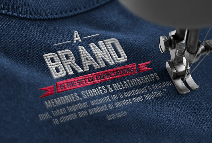
Now that you understand the marketing magic it can make, also think about how you will approach designers in the future. Imagine what you might be missing out on if you just went to a designer or developer you found through crowdsourcing and asked them to “design you a website”. Would you have the confidence in hiring them to produce a design that’s going to appeal to your audience and align with your brand vision? Brand identity design is a multi-step process where each step is based on the needs of your target audience and the goals of your brand. Whether you’re totally overhauling your brand identity or you’re just starting, always strive for consistency and look for ways to apply great design at every touchpoint of your brand. To have a consistent visual message that’s on brand, hire a professional designer or design team that understands right process.  What is branding?Your brand is a whole lot more than just a pretty logo; it's how consumers see the business you run. Your brand is a unified expression of your style in language, storytelling, design, and experience. They work together to create "the vibe" with your target audience, influencing them to interact with your brand and eventually make a purchase from you. You have a brand, whether you realize it or not. Congruent design, strategy, people, settings, touch-points, "call to action," and customer service collectively constitute the ideal strong brand. Always keep in mind that your brand is your commitment to find a solution, therefore
Why should you care about branding? Having a strong brand has become essential to setting your company apart from your rivals as millions of businesses struggle to gain attention both online and offline. Products and services can frequently have short lifespans due to the increased competition; yet, brands can endure for a very long time. If managed and created with longevity in mind, your brand can change direction to suit the market. If your visual communication does not successfully link your visitor with your messaging, it is useless to have a fantastic product or service. The most important tool for tying together all of your communication channels and making your offers more clear is branding.  Why is branding important for your business?Many new firms launch without a brand but with only a concept. It can be difficult to convey the concept to others. Although you could believe that everyone understands it the same way as you do, branding is essential for connecting your idea with your audience and engaging with them. When branding is done well, it can…
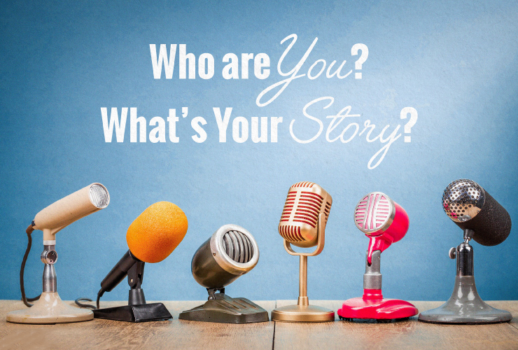
 What is Brand Identity?Your brand identity, which distinguishes your company from the competitors, is the distinctive physical personality of your firm, just as your personality makes you unique. Your brand's identity, or outside look, affects how customers perceive you whenever they encounter with you in person or online. Visual brand identity refers to your company's cohesive visual design message or visual vocabulary that should flow naturally across all of your marketing touchpoints, including your logo, colors, typography, imagery, packaging, website, social media, and all other visual components. These visual signals are intended to convey the ideals of your businesses, and they may unintentionally change how your consumers perceive everything about your company, from your relevancy to your perceived value and your reliability.  How do you create your brands’ visual identity?Prior to developing your brand's visual identity, you must first do research and formulate a plan before moving on to the design step. The planning step doesn't have to take a long time. Some of the larger agencies want you to think this is the case so they can explain why it costs so much to create a "brand strategy document." Many brand strategy documents, in my opinion, are costly, overworked multi-page documents that are packed with buzzwords, airy wanker branding lingo, and other things that a small business does NOT need! What does your designer need to know…All your designer needs to know before they can create the visuals of your brand identity, is the following foundational questions, plus a few others, however, these are the main questions:
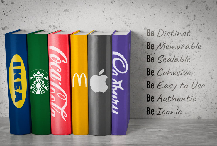
Answer those questions and your designer should be ready to bring your brand identity to life and translate who you are as a brand into a series of design assets you can use across your products/services and marketing material. Engage a design team that has a proven track record and can get to the heart of your brand quickly. The right team will create unique visual design solutions that align with your brands’ values, reflects your brands’ mission, and appeal to your target market. All of the key branding design elements can eventually take the form of the brand style guide. This is a tangible document that will help unify your message on and offline.  What makes a successful visual brand identity?A simple logo alone does not make for a strong brand identity. Your brands’ identity needs to be a series of thoughtfully researched and designed elements that are designed with purpose with the following in mind;
Tips to avoid with branding:
 Cheap branding could cost you sales and here’s why…Initial feelings matter a ton! You never get another opportunity to make a first impression! People will judge you based on how your brand looks and feels when they visit your website. If your brand doesn't look professional, it could give the impression that your business is only as good as how it looks. If you don't have the right look, you could lose sales. Everything we do relies on design, and great design adds value. Configuration believing is turning into a significant upper hand. It's the only authentic, measurable thing you can control that can set you apart from your rivals. You can't afford to skimp on design because it is the first thing people notice online and offline. Hire a design professional with a proven track record and only hire them if you like their portfolio because excellent design does not happen overnight. It is a process that involves in-depth research and constant evolution. If their portfolio doesn't work, their work for you probably won't either. 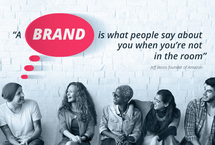 So, look at branding as an investment in your business, especially when you’re established and making a profit. A lot of businesses pivot over time, so every two years at least, you should ask yourself if your branding is still relevant and congruent with your business and brand’s values. Does it appeal to your target market today?
iOS 16 battery symbol, flat inside and the % within.
It's ok, but not so clear when it's in charging mode. Have to keep the batter widget on the screen to see the progress. It looks ok, may be if the % inside is set to exclusion or division or empty to see background, it can be more visible. As of now light green and text white while charging has less visibility than while it's not. Hope they can fix it. 1. Sit uprightIt helps to be alert and engaged. So if you can, sit upright with your feet on the floor about hip-distance apart and your hands on your lap.  2. Move around as neededYou don’t need to sit completely still. Feel free to make small adjustments as you need, like scratching an itch or changing the way you’re sitting.  3. It's OK to have "bad" daysSome days, feel easy. And others, feel hard. That's normal and expected. But even on "bad" days, you make progress. So just keep going.  |
